Olson's Bicycles
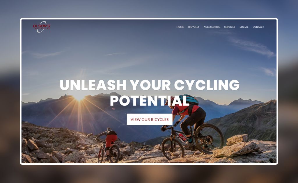
Olson’s Bicycles has long been a trusted name in their community, but their online presence needed a refresh. We set out to create a digital experience that captures the spirit of cycling while giving the brand a modern edge.

Visual Identity Inspired by Motion
Cycling is all about movement—the steady rhythm of pedals, the rush of the road, the sense of freedom in motion. We built Olson’s visual identity around that same feeling. Through energetic colors, bold type choices, and imagery that captures both speed and community, we created a look that feels alive and forward-moving. The result is a brand presence that reflects the ride itself: dynamic, approachable, and always in motion.

Brand Colors
Olson’s Bicycles needed a visual presence that felt as strong and dependable as the bikes they sell, while still sparking energy and excitement. We leaned into a bold yet refined palette that communicates motion, strength, and confidence. The end result is a brand that feels timeless but never static—rooted in reliability while full of forward momentum.
Deep Crimson
RGB (145, 11, 11)
Cardinal Red
RGB (164, 12, 12)
Charcoal Grey
RGB (37, 37, 37)
Graphite
RGB (56, 55, 55)
Type Face
Type isn’t just words on a page—it’s a voice. For Olson’s, we paired crisp, modern headlines with clean, approachable body text, creating a balance of authority and accessibility. The typography speaks with confidence but remains easy to read, helping every rider—from first-timers to seasoned cyclists—feel welcomed and understood.
Aa
Roboto – Titling
Bold
Aa
Lato – Body
Regular
WE ARE YOUR PARTNER IN
Your Dream Website Won't Build Itself. (But We Can)
At Studio B612, we turn ideas into impactful designs that help your brand stand out and grow. Whether you need a stunning website, a fresh visual identity, or marketing that connects, we’re here to bring your vision to life. Let’s work together to create something unforgettable.