Introduction
Fonts are sneaky little things. They’re everywhere—on billboards, websites, packaging, even your morning coffee cup. Yet most people don’t notice them until they’re bad. (Comic Sans, anyone?) What many don’t realize is that fonts do more than make words legible. They carry emotion, personality, and subtle cues that influence how we feel about a message, a product, or even an entire brand.
Typography is the unspoken voice behind your words. And when used thoughtfully, it can transform a brand from “just okay” into unforgettable. Let’s dive into how fonts work their quiet magic and why choosing the right one can make—or break—your design.
Fonts Are the Voice of Your Brand
Imagine a friend sending you a text that says “We need to talk.” Now imagine that same message with a ton of emojis. Same words, very different vibe. Fonts work the same way.
Typography is like tone of voice in a conversation. A serif font (think Times New Roman or Georgia) feels traditional, trustworthy, and maybe even a little formal. A sans-serif font (like Helvetica or Arial) feels clean, modern, and approachable. Decorative or script fonts bring in flair, elegance, or playfulness.
In branding, these choices matter. The font on your logo, your website headlines, or your business cards instantly sets the tone before you even say a word. It tells people whether you’re fun and quirky, sleek and professional, or warm and approachable. Fonts make first impressions—quietly, but powerfully.
How Fonts Influence Emotion
Different fonts can spark different emotions, just like colors or music. Think of it this way: fonts are the soundtrack to your brand’s story.
-
Elegant scripts feel sophisticated and romantic—perfect for weddings, luxury goods, or high-end restaurants.
-
Bold, modern sans-serifs feel strong and confident—often used by tech companies or startups that want to feel cutting-edge.
-
Playful, rounded fonts feel friendly and approachable—ideal for family brands, children’s products, or quirky small businesses.
-
Monospaced fonts (the typewriter style) feel retro and intellectual—used in design spaces that lean into nostalgia or “geek chic.”
Even subtle differences can change the vibe. A slightly condensed font feels more serious and authoritative, while a wide, airy font feels relaxed. Fonts carry personality in every curve, stroke, and space.
At Studio B612, we’ve been known to debate fonts longer than we care to admit (there may or may not have been dramatic sighs involved). But those debates matter—because we know one tiny change can shift the entire emotional impact of a design.
Consistency Matters
Here’s the thing: it’s not just which fonts you use, it’s how you use them.
Too many fonts in one brand can make your design look chaotic, like a party where everyone’s talking over each other. On the other hand, sticking to just one or two fonts creates a sense of unity and professionalism.
Think about some iconic brands:
-
Vogue — instantly recognizable with its elegant serif typography.
-
Google — clean, approachable sans-serif that mirrors its user-friendly design.
-
Nike — bold, confident typography that matches its “Just Do It” ethos.
Consistency builds recognition. When your fonts are used thoughtfully across your website, social media, and print materials, people begin to associate that “look” with you. Fonts become part of your brand identity, as recognizable as your logo or your color palette.
Fonts in Action: Small Details, Big Impact
It’s not just the font itself that matters—it’s how you use it. Typography has layers of nuance:
-
Headlines vs. body text: Your headline font needs to grab attention, while your body text needs to be easy on the eyes. Choosing the wrong font for long paragraphs can leave people squinting (and leaving your website faster than you’d like).
-
Size and spacing: Adjusting line height and letter spacing can completely change readability and feel. Tight spacing feels urgent and compact, while airy spacing feels relaxed and approachable.
-
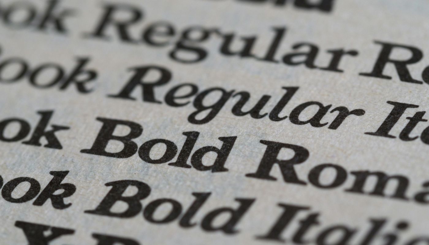
Weight: Bold, regular, and light versions of a font create hierarchy and emphasis. Even choosing between “medium” and “semibold” can change the tone.
Typography is like cooking: the ingredients (fonts) matter, but how you mix them (spacing, weight, hierarchy) determines the final flavor.
Choosing the Right Fonts for Your Brand
So, how do you pick fonts that fit your brand without spiraling into a 3-hour scroll through Google Fonts? (Don’t worry, we’ve been there too.)
Here are a few guiding principles:
- Start with your brand personality. Are you fun and quirky, serious and professional, or sleek and modern? Your font should match that vibe.
- Prioritize readability. Fancy fonts may look cool in a headline, but if they’re hard to read in body text, they’ll frustrate your audience.
- Limit your palette. Pick one font for headlines and one for body text. If you want variety, use weight and style variations rather than grabbing a whole new font.
- Test everywhere. Make sure your fonts look good on desktop, mobile, print, and even when scaled down to a tiny logo.
- Trust your gut (and your designer). Fonts are as much about feeling as function. If something feels “off,” it probably is.
Conclusion: Fonts Are More Than Letters
At the end of the day, fonts are about more than making words look nice. They’re about creating an emotional connection with your audience. A font can whisper “trust us,” shout “look at me,” or sing “let’s have fun.”
Every curve, stroke, and space tells a story. And when you choose fonts intentionally, that story becomes clearer, stronger, and more memorable.
So, the next time you glance at a headline, a product label, or a website—take a closer look. Ask yourself: how does this font make me feel? Odds are, it’s shaping your impression in ways you didn’t even realize.
Ready to Find Your Perfect Font Match?
At Studio B612, we worry about fonts so you don’t have to. Whether you’re building a brand from scratch or refreshing an existing one, we’ll help you pick typography that matches your story, your vibe, and your audience—without the late-night font panic.
Let’s chat about how the right fonts (and the right design team) can bring your brand to life. Reach out to us today!